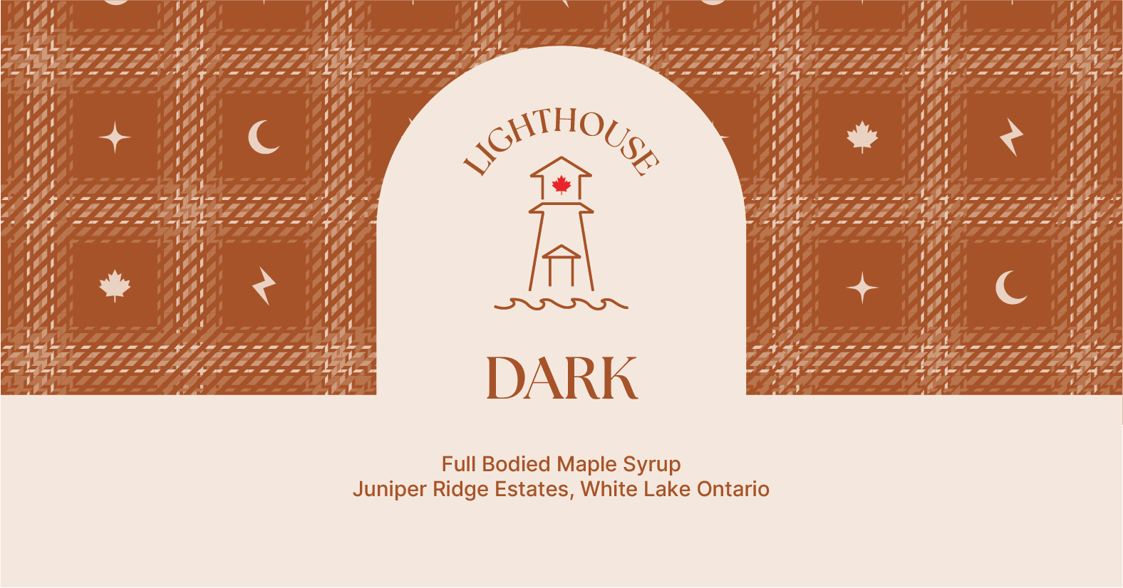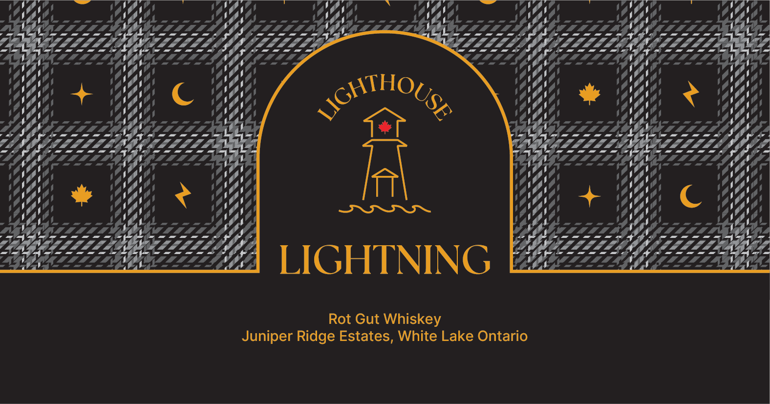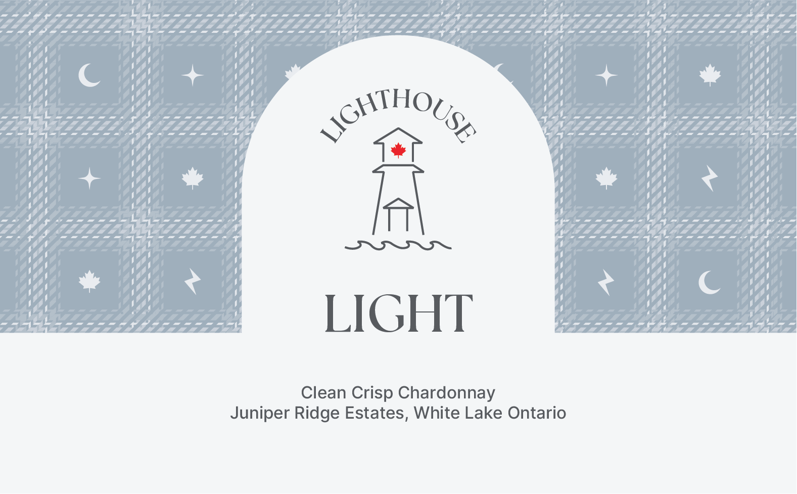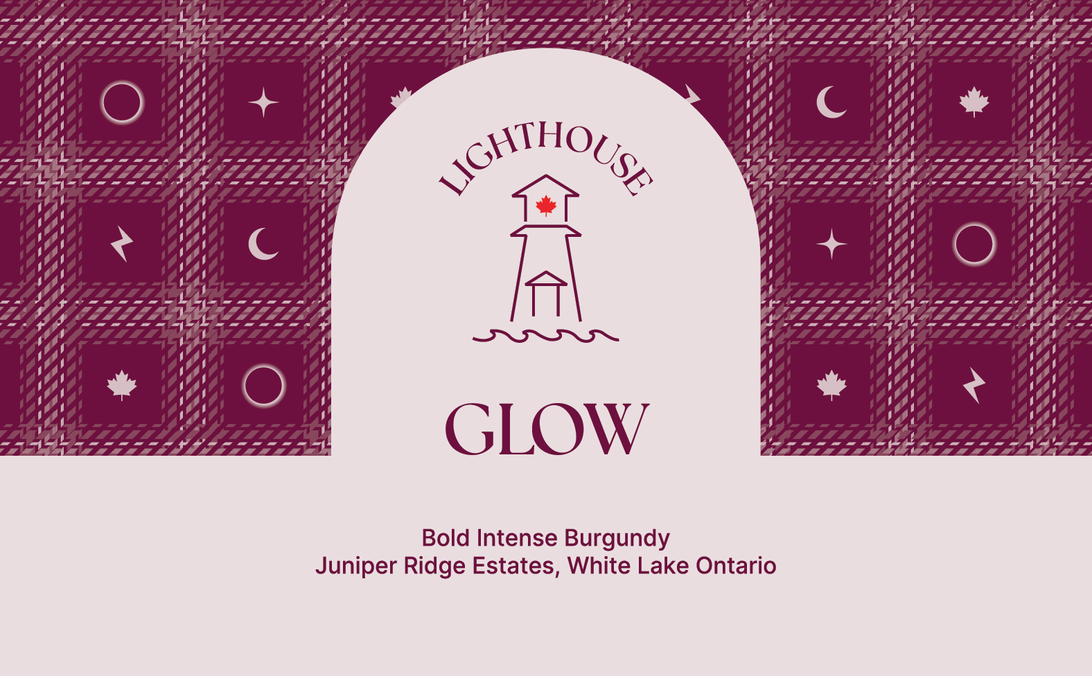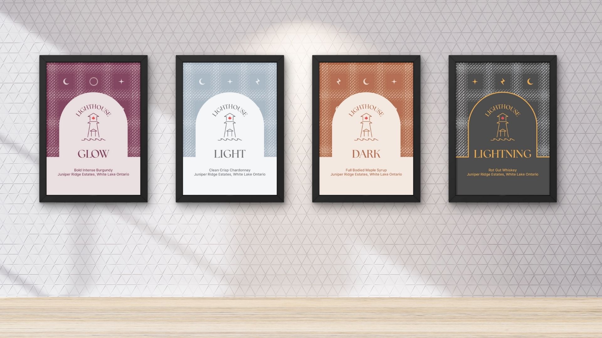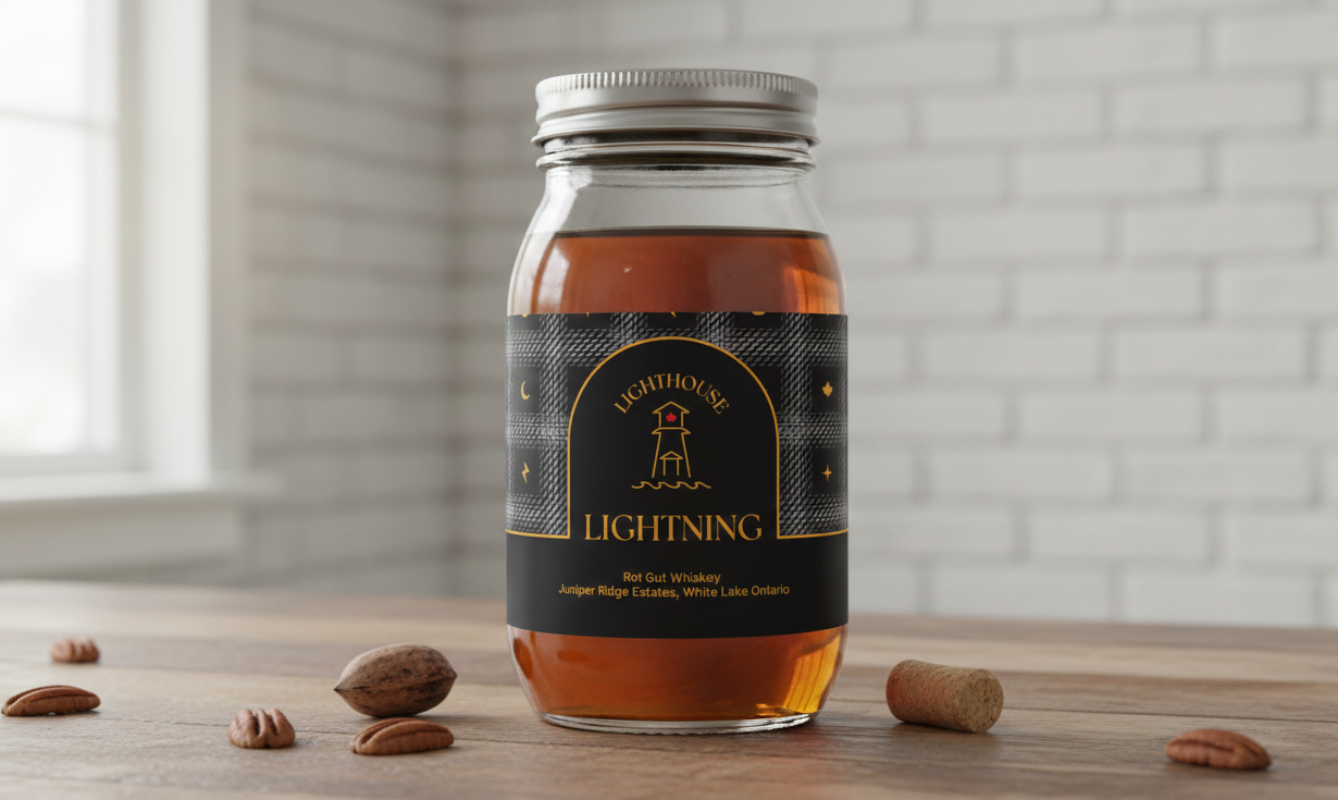
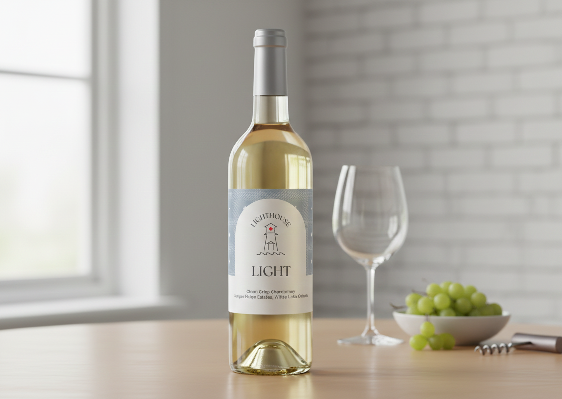
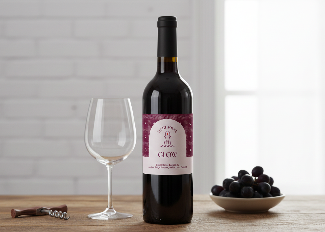
The logo design was inspired by a real lighthouse, with a maple leaf as a defining feature. The vision was to create a logo and label system that could easily adapt to different colours and themes for each product. Beginning with maple syrup (Dark), whiskey (Lightning), and white wine (Light), each product required its own distinct colour while maintaining a cohesive design. This led to the idea of developing a unique symbol for each product and incorporating it into the label pattern, creating a unified yet flexible visual identity.